Nelson Brand and Website Real-estate development and construction 2026
One company that develops and builds, and a site that answers both.
The public site for a Des Moines developer, investor and general contractor. Development and construction each get their own path through it, the portfolio filters by sector, and the investor material is stated before anyone has to ask.
The problem
Nelson does two things that are usually separate companies. It develops property, and it builds — sometimes its own projects, sometimes other owners'. It also raises equity from private investors and borrows from lenders.
Four readers, then, arriving for different reasons: an owner looking for a contractor, an operator looking for a developer, an investor, and a lender. The site has to sort them before it tells them anything.
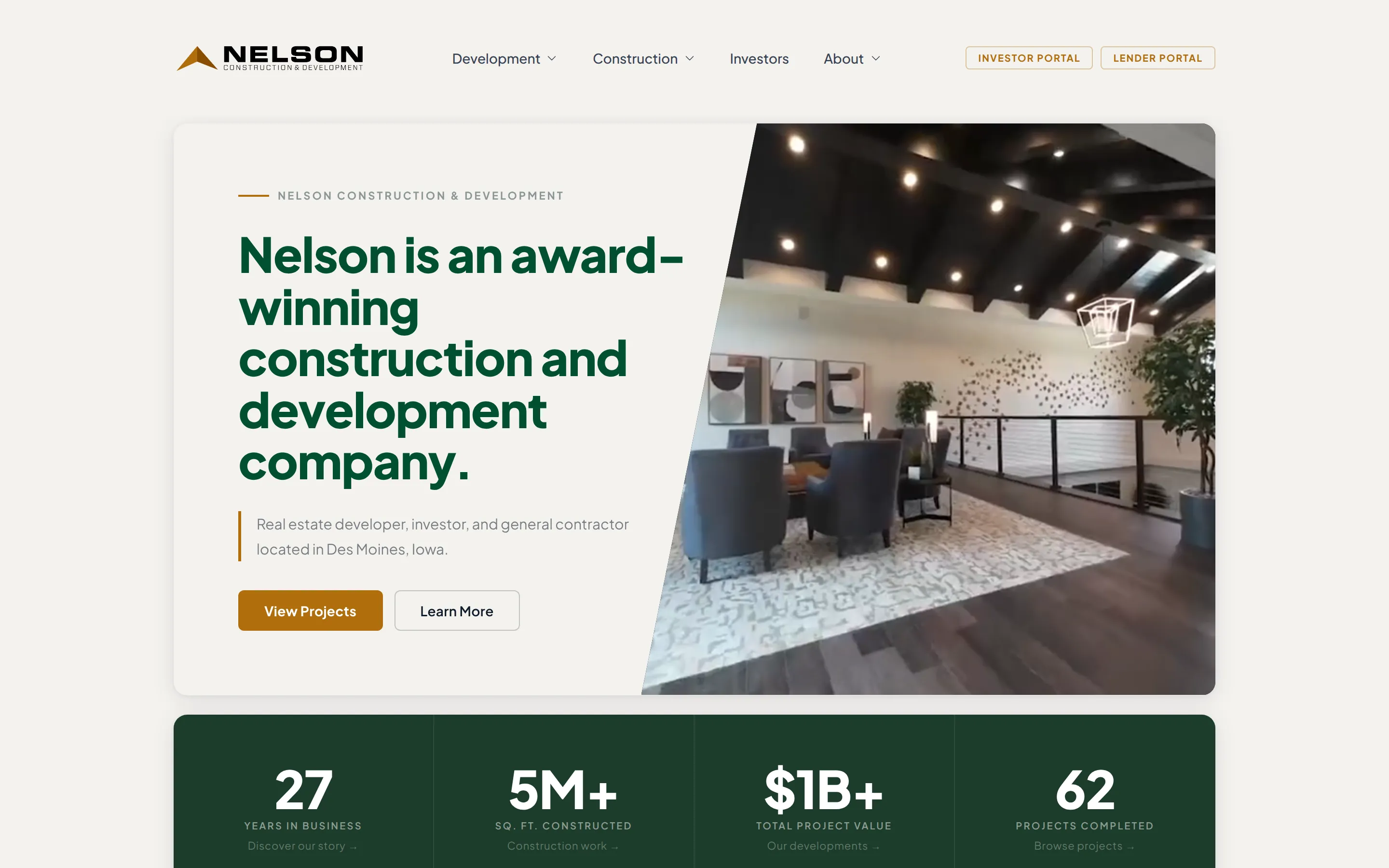
Development and construction are separate paths
Each division has its own branch of the navigation and its own set of pages. Development is organised by sector — behavioral health, senior living, multifamily. Construction is organised by how the work runs: what we build, services, process, projects.
A visitor picks a division first, and what follows is written for that reader.
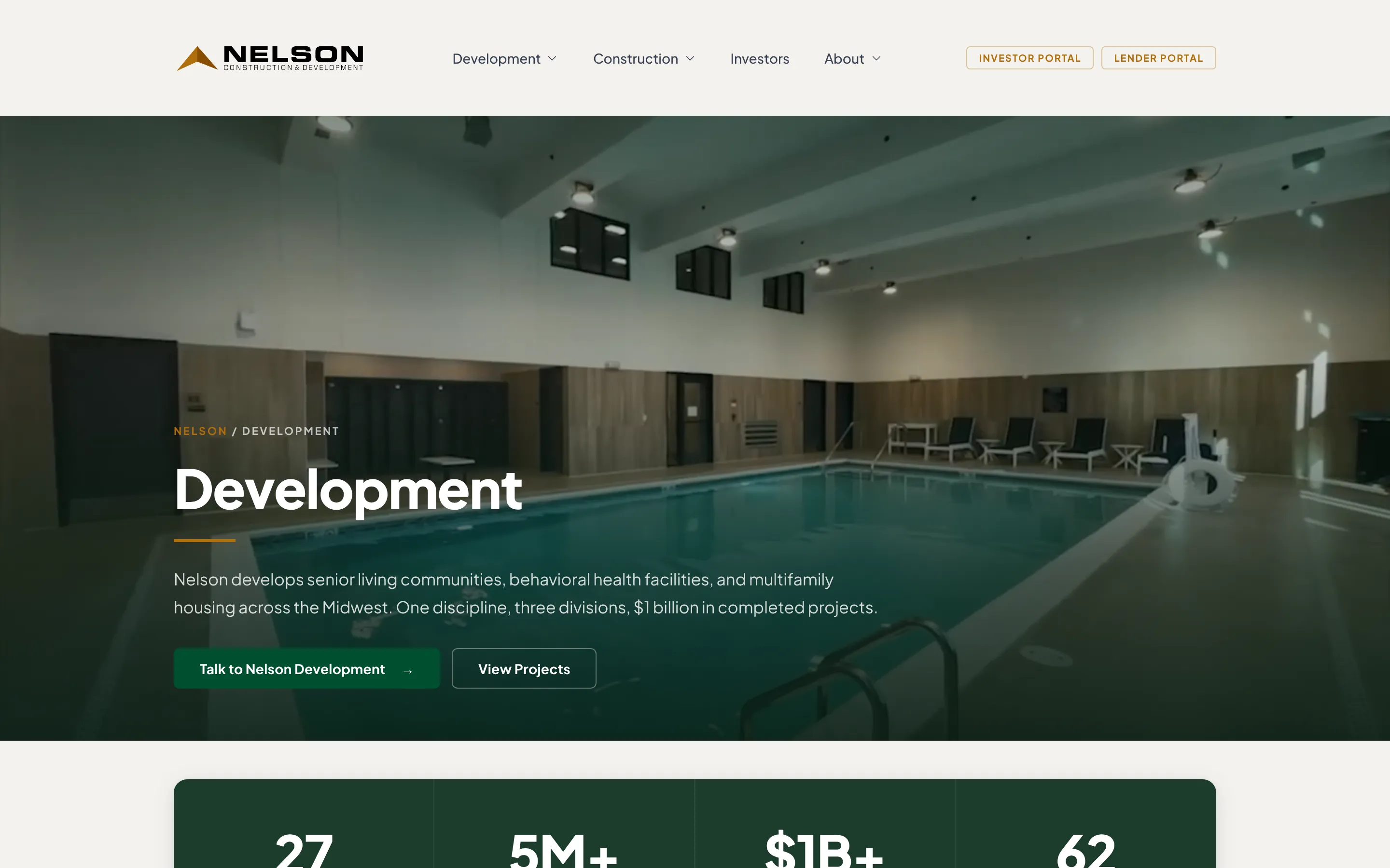
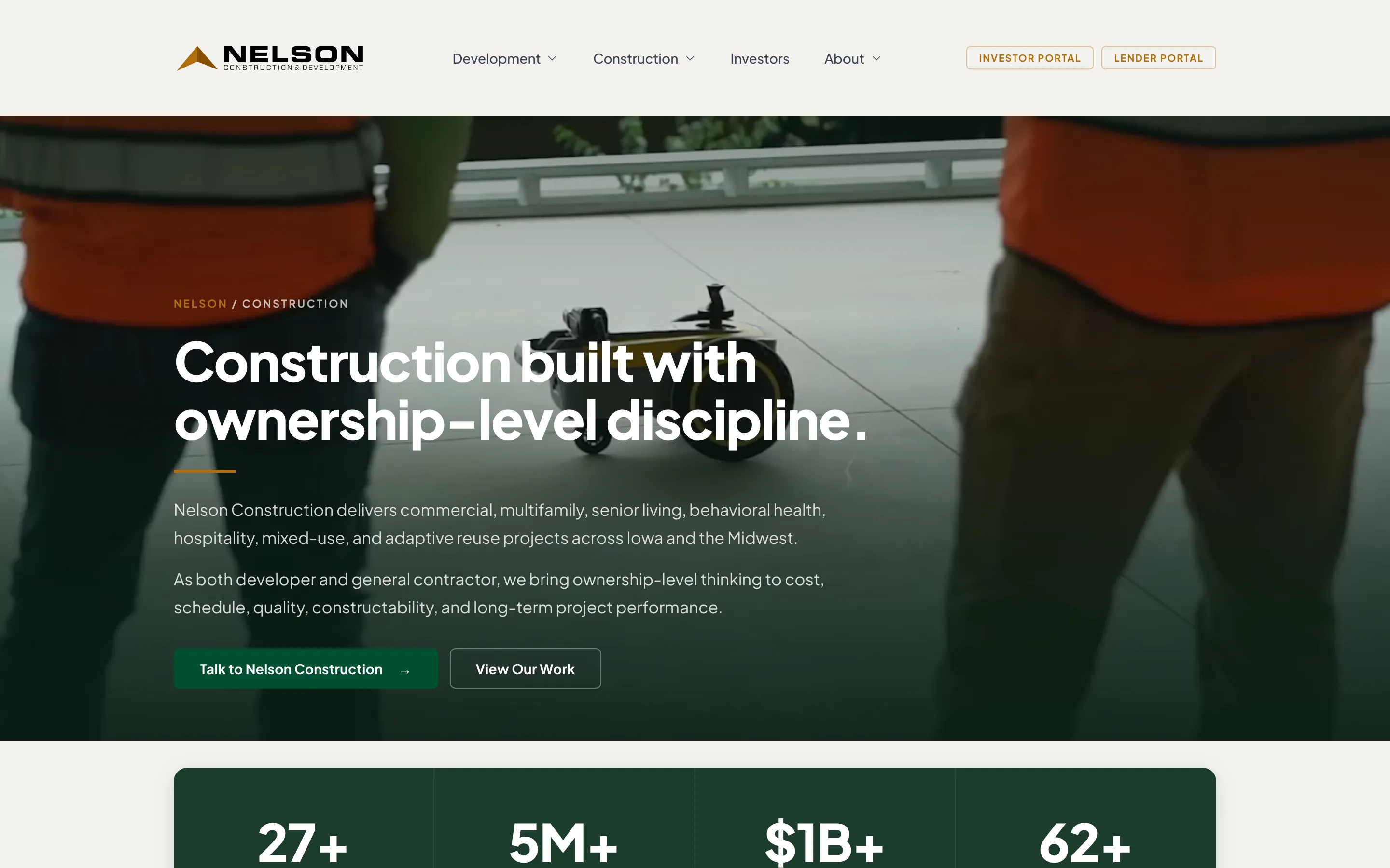
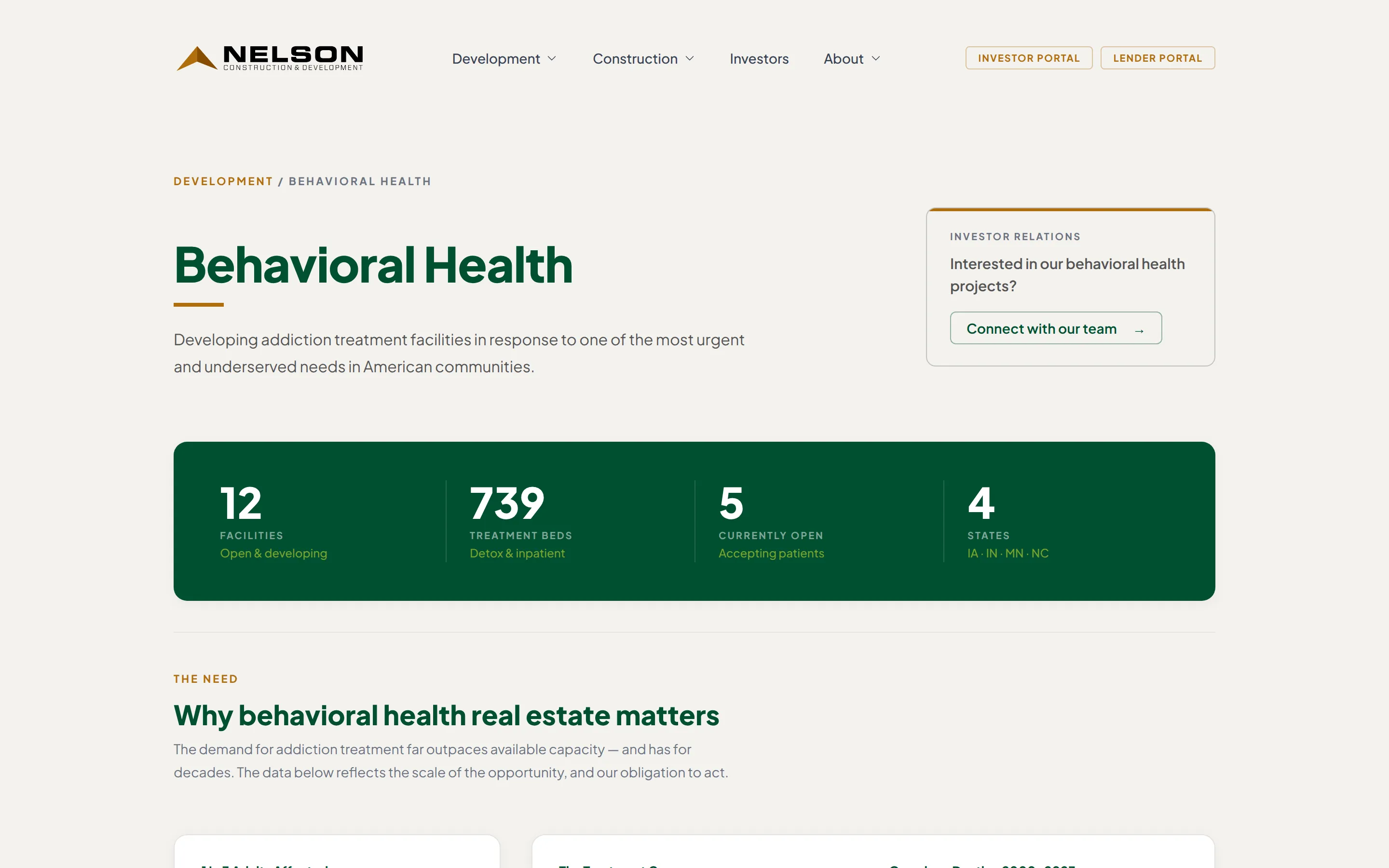
A sector page leads with the record, then the market
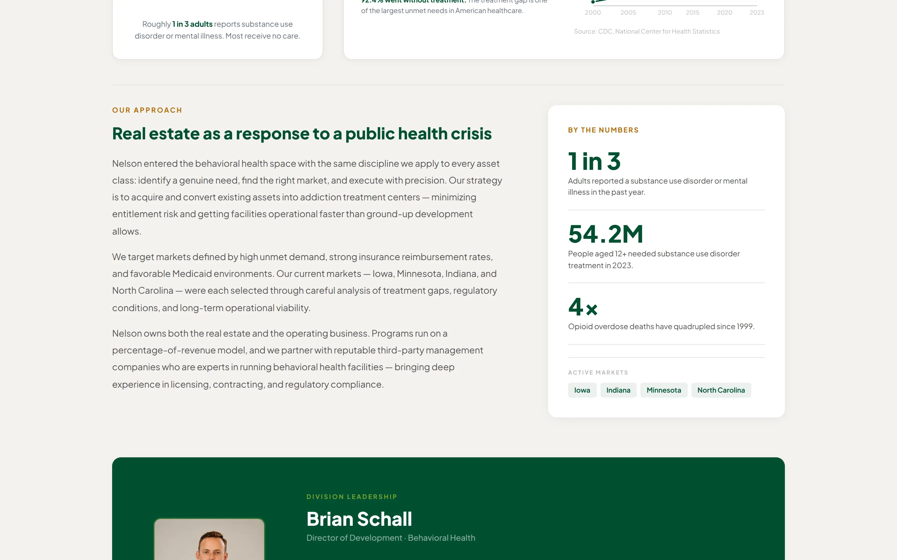
Each development sector opens with what Nelson has built in it — facilities, beds, how many are open, which states — set as a band across the top. Underneath sits the case for the sector itself: why it needs building, with the figures behind the demand.
That order is for an investor. Track record first, market second, and a route to investor relations beside both.
One portfolio, filtered by sector
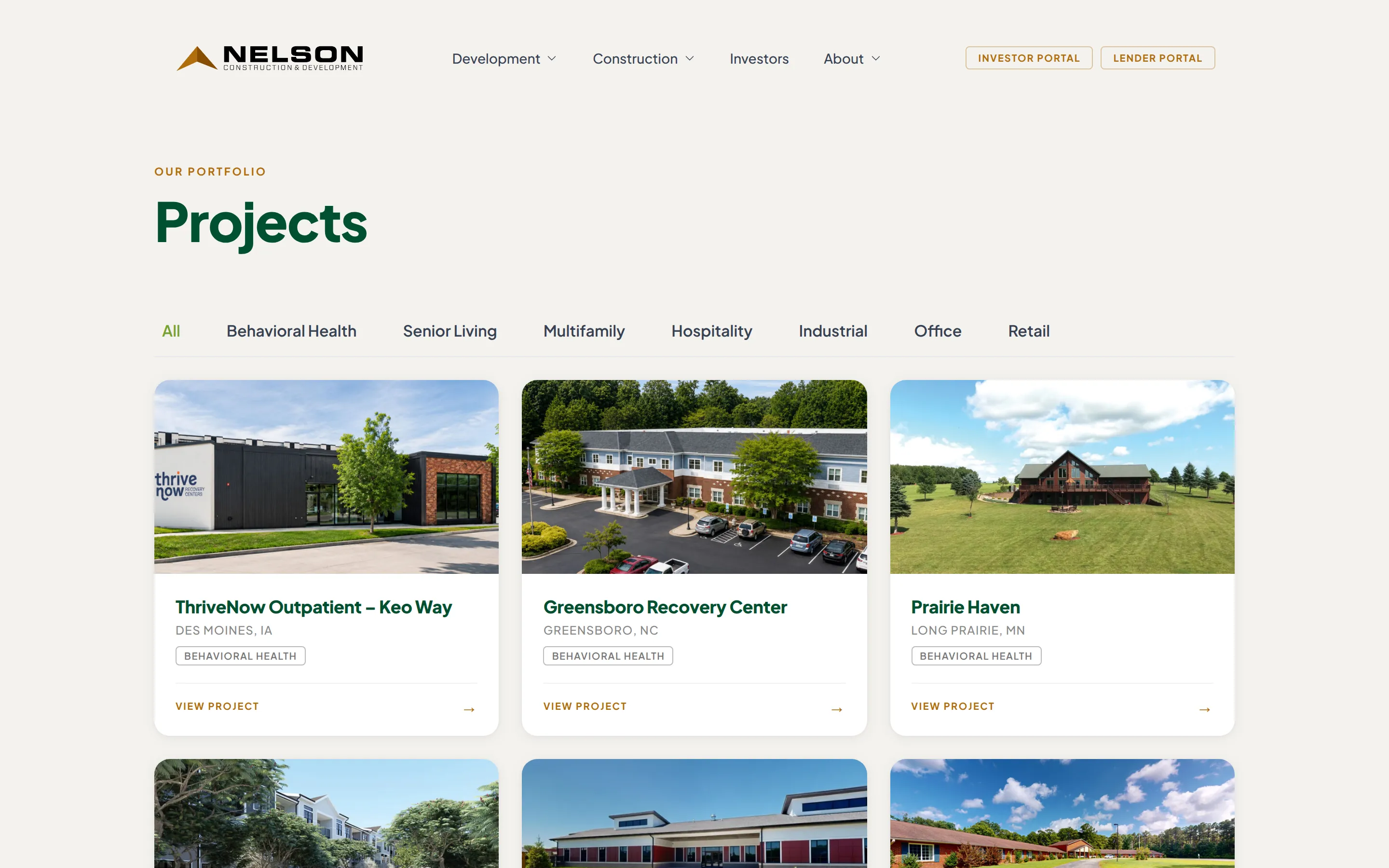
Every project sits in a single index and filters by sector: behavioral health, senior living, multifamily, hospitality, industrial, office, retail. A card carries the photograph, the name, the location and the sector tags.
Projects currently raising carry a Financing Open badge, and ones that have exited carry Sold. That badge is where the marketing site meets the investor side.
The investor material is public up to the legal line
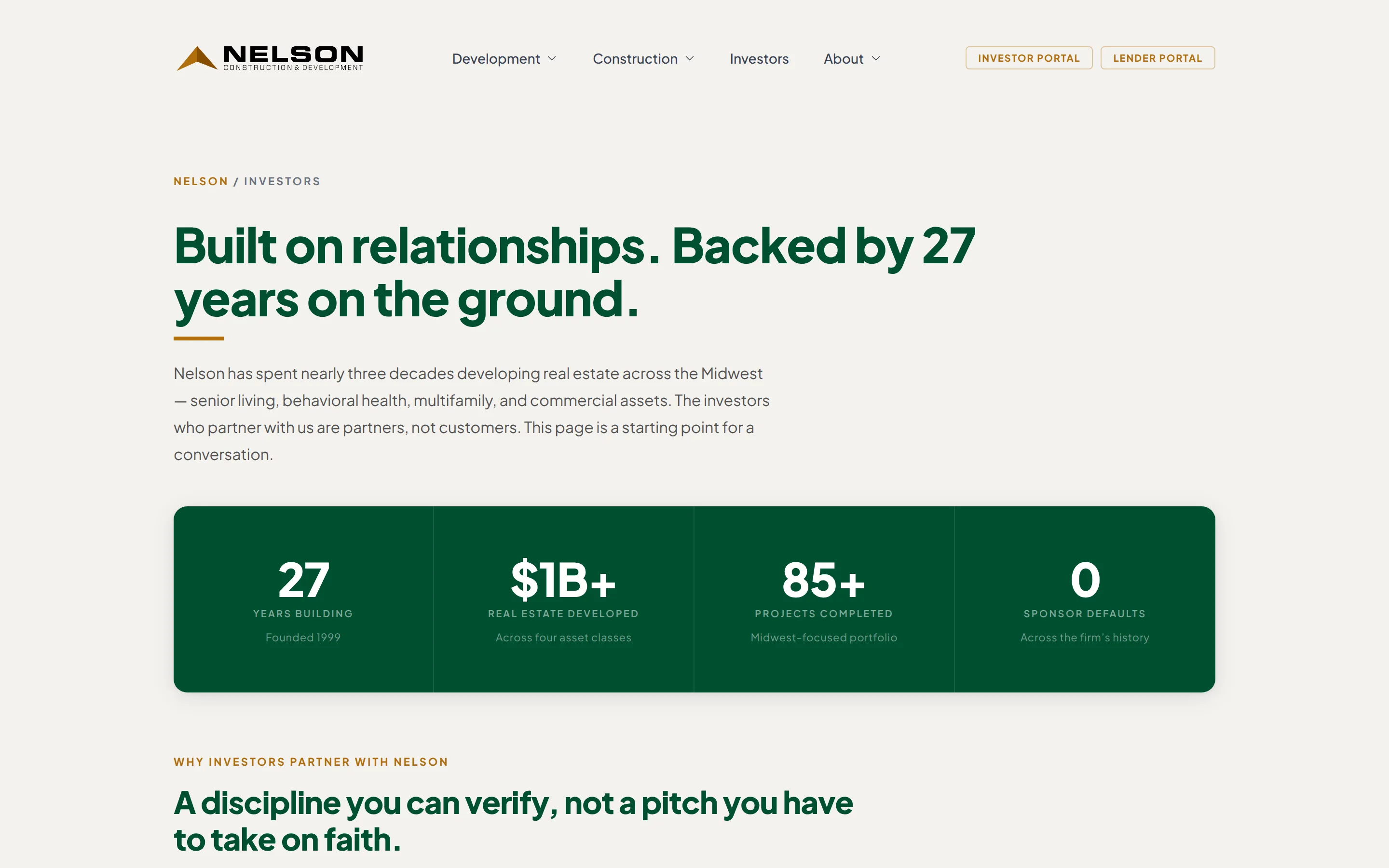
The investors page says what the arrangement is: Nelson co-invests in its own deals, the current raise is named, and the portal's contents are listed — distributions, K-1s, project updates, capital account balances. The accredited-investor restrictions sit on the page rather than behind it.
Past that point it needs a conversation and an NDA. The page exists to get a qualified reader to that conversation and stops there.
The same system runs the private tools
The identity does not end at the public site. The offering pages, the investor portal and the lender portal are built from the same palette, type and components. An investor who reads an offering and then signs in to check a distribution does not change design.
The phone layout is its own
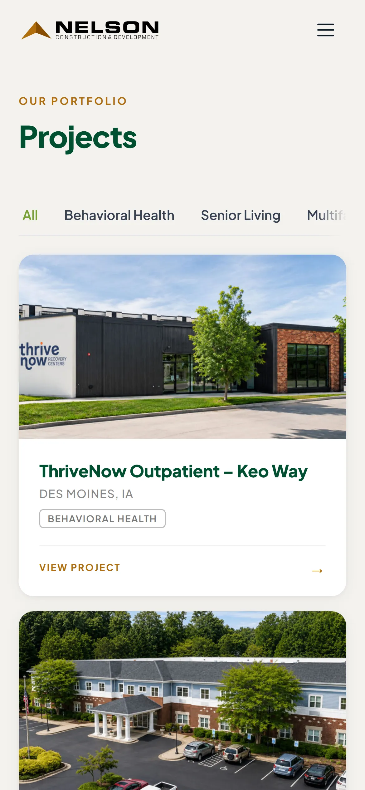
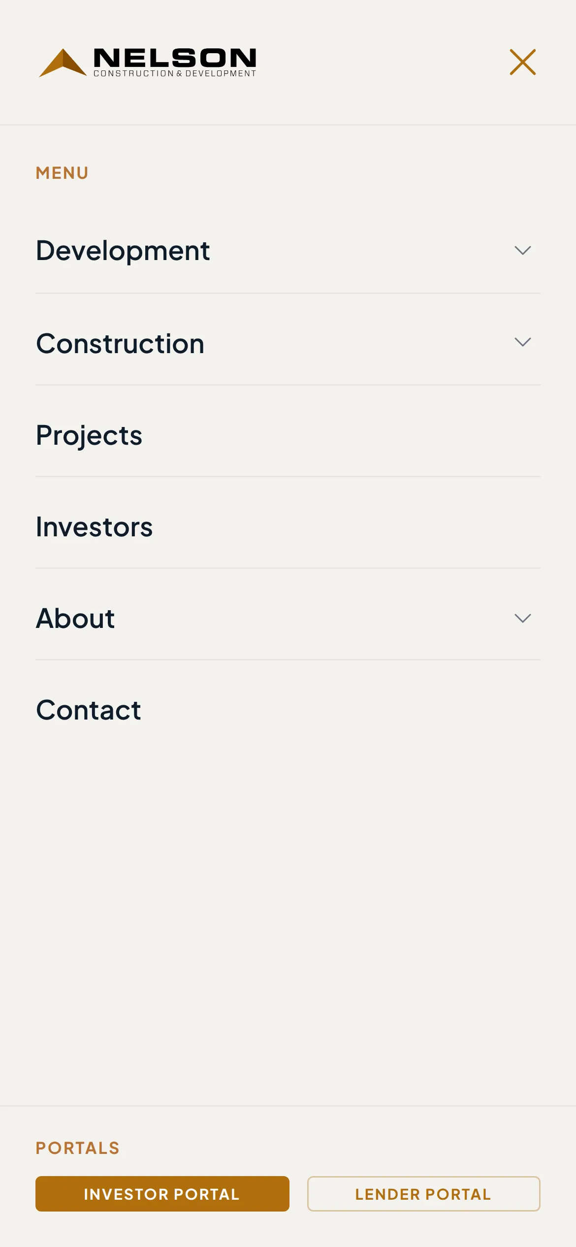
Not the desktop narrowed. The hero video moves above the headline and takes an angled crop, the navigation collapses to a menu holding both divisions and both portals, and the project cards stack to a single column.

What changed
- Two businesses, one site. Development and construction each have a path through it, and a reader picks before anything else is asked of them.
- The portfolio became one filterable list. Seven sectors, with financing status on the card.
- The investor route is on the public site. Terms, the current raise and the portal's contents are stated before anyone has to write in.
- The brand runs past the website. The same system carries into the offering pages and the portals behind the login.