The Canary Lofts Real estate — multifamily leasing and lease-up 2021
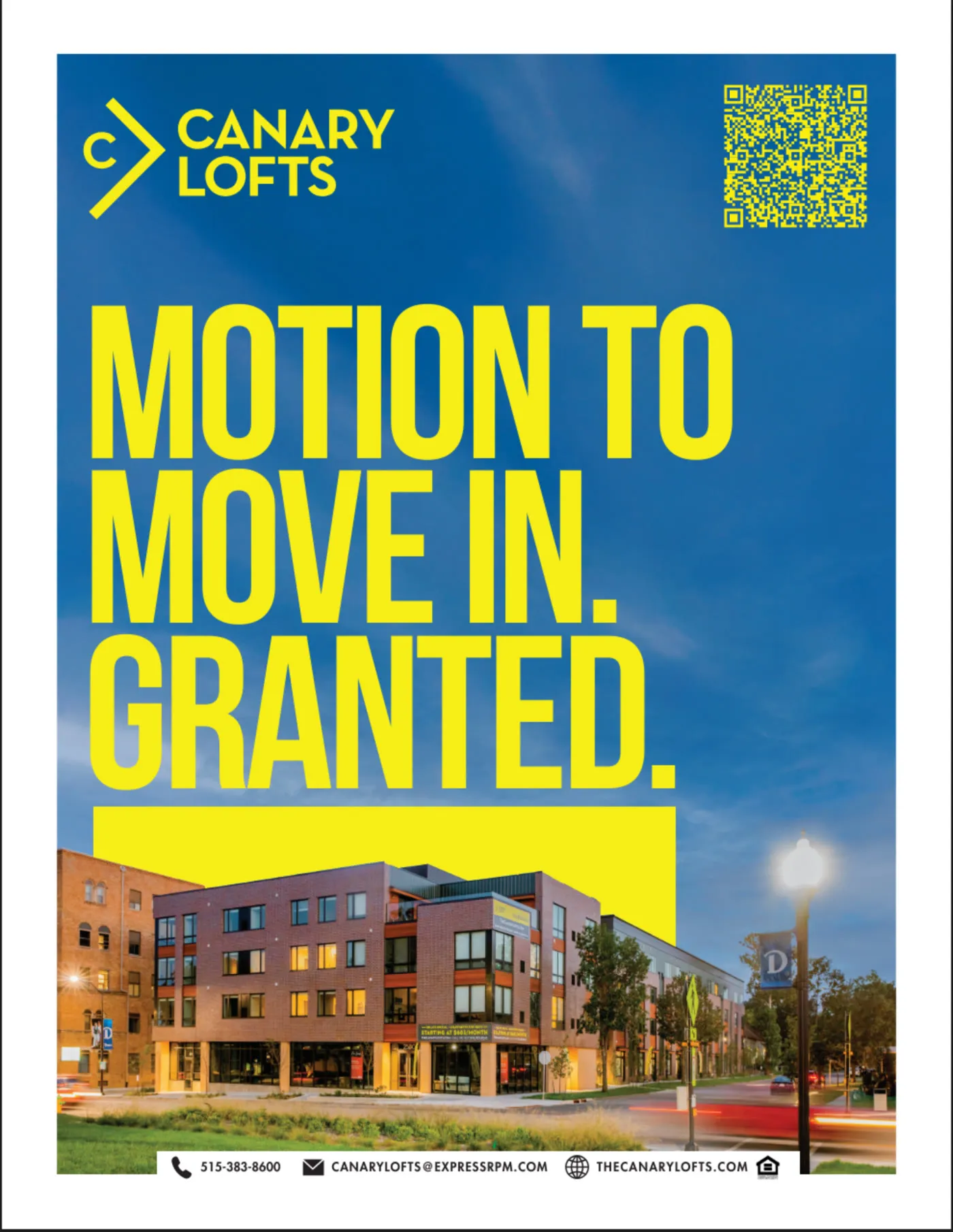
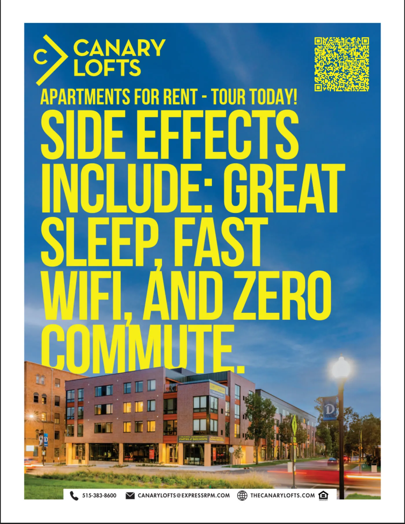
A building across from a law school and a pharmacy school, with a flyer for each.
Name, identity, website and signage for a new apartment building in the Drake neighbourhood of Des Moines. The address invites one obvious pitch; the work makes a different and larger one.
The problem
The building sits directly across from Drake University. The obvious way to market it is as student housing, which sets who looks at it and how long they stay.
It holds two-bedroom plans over a thousand square feet as well as studios at 330, in a neighbourhood with a live music venue, an art-house cinema and a dozen places to eat within a five-minute walk. It was marketed as a place to live near a university rather than as housing for people attending one.
The mark is both initials and a bird
The mark is a C and an L. The L stands on its point beside the C, and the two together read as a head with an open beak. It ships in three forms: dark on yellow, reversed on grey, and plain.
The animation brings the L in first, then the C and the wordmark.
Yellow is the one element carried everywhere — website, mailer, flyers, and the banner and feather flags on the building.



The campaign was cut by audience
Drake sits across the street and has a law school and a pharmacy school, so the flyers were written per school rather than as one student message. The law flyer reads "Motion to move in. Granted." The pharmacy flyer reads "Side effects include: great sleep, fast wifi, and zero commute."
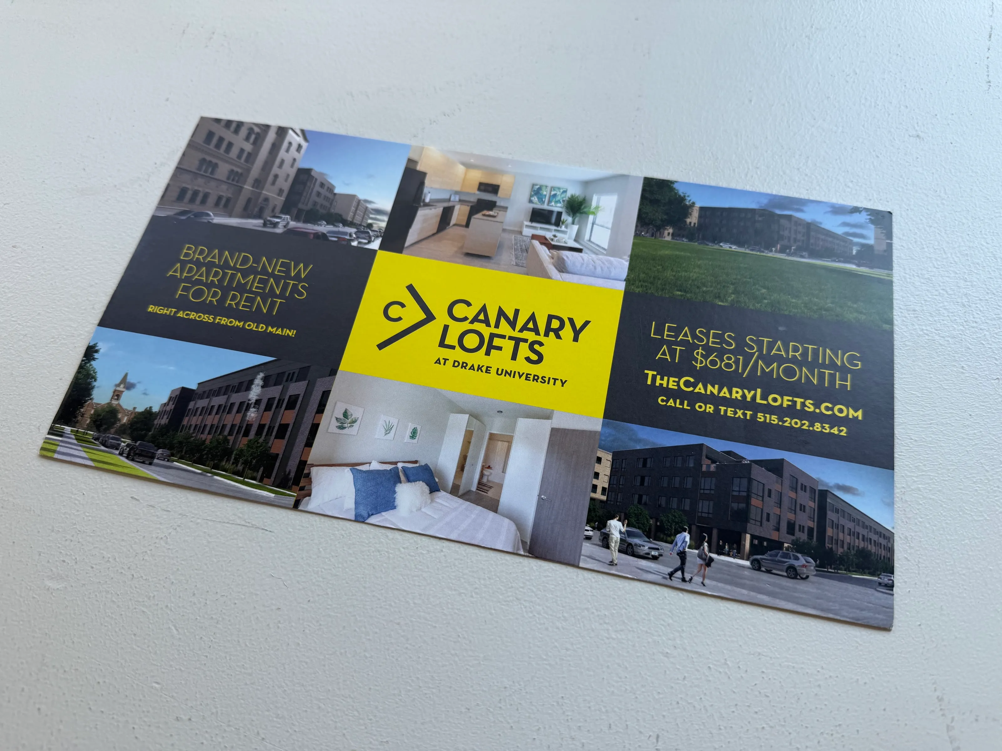
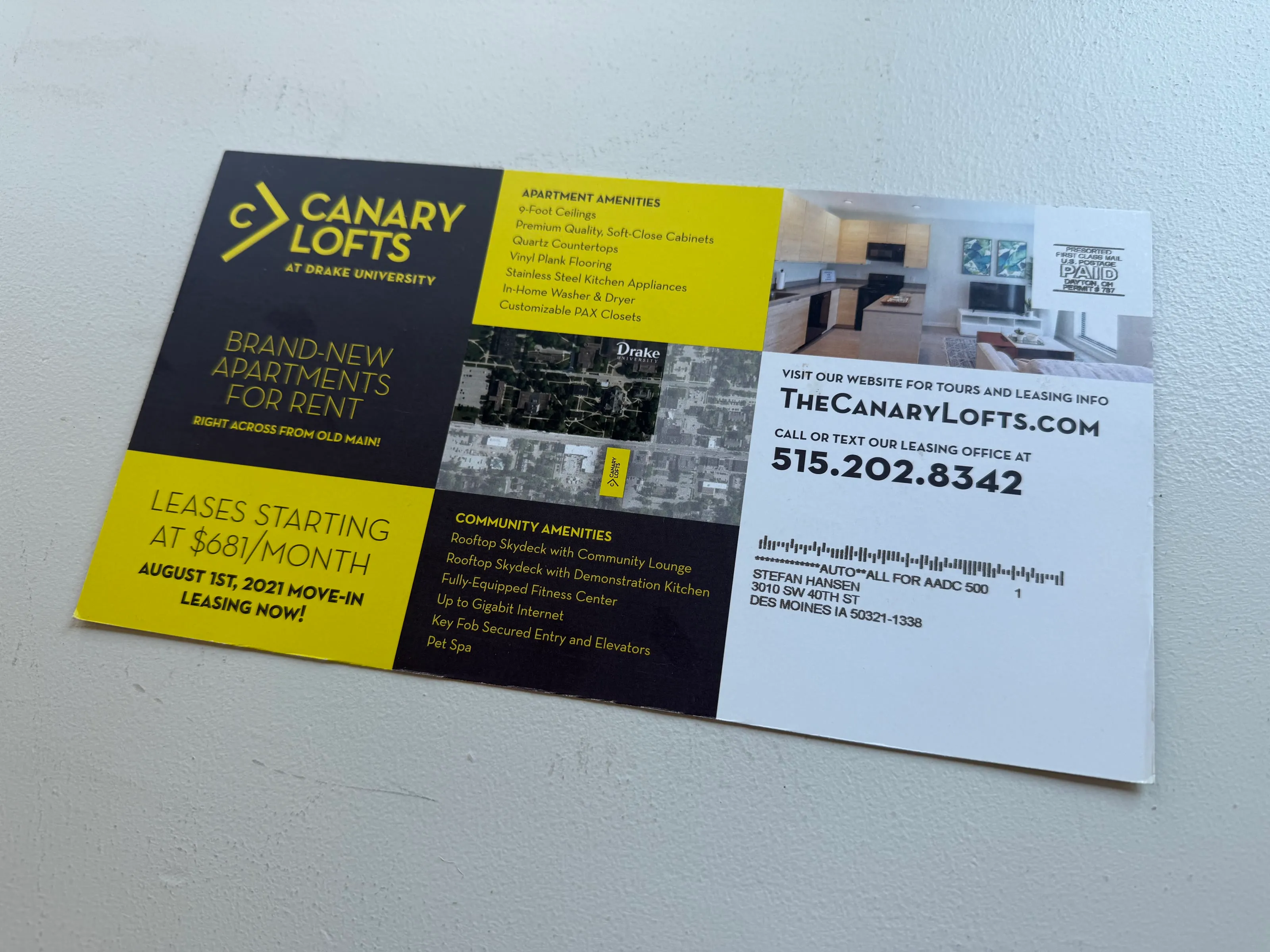
The direct mailer went wider and said so plainly — "Brand-new apartments for rent, right across from Old Main" — with the lockup carrying at Drake University beneath it.
The website sells the neighbourhood
The site as it stands leads on the area rather than the campus. Its neighbourhood page names thirteen places rather than describing the area — xBk Live, Varsity Cinema, Mars Cafe, Lucky Horse, Gursha Ethiopian Grill, the Drake Diner — under one heading, "Walkable by Design," and one measure: five minutes on foot.
Each is a business a prospect can check on the way to a tour.
Sixteen plans, grouped into three types
The building has sixteen floor plans. They are grouped into three types — studios, alcoves, two-bedrooms — so the first choice is the type and the plans sit underneath it.
Four studios run 330 to 528 square feet, six alcoves sit around 540, and six two-bedrooms reach 1,040.
The site leads to a booked tour
Floor plans, amenities, the neighbourhood, a gallery, pricing, tour booking, and the resident portal for people already living there. Everything on the site leads to a booked tour.
The amenity headings describe use rather than listing equipment — "From Chill Nights to Game Nights," "Built for Sunset Hangouts" — over the rooftop skydeck, sky lounge, demonstration kitchen and pet spa.
The identity carries onto the building
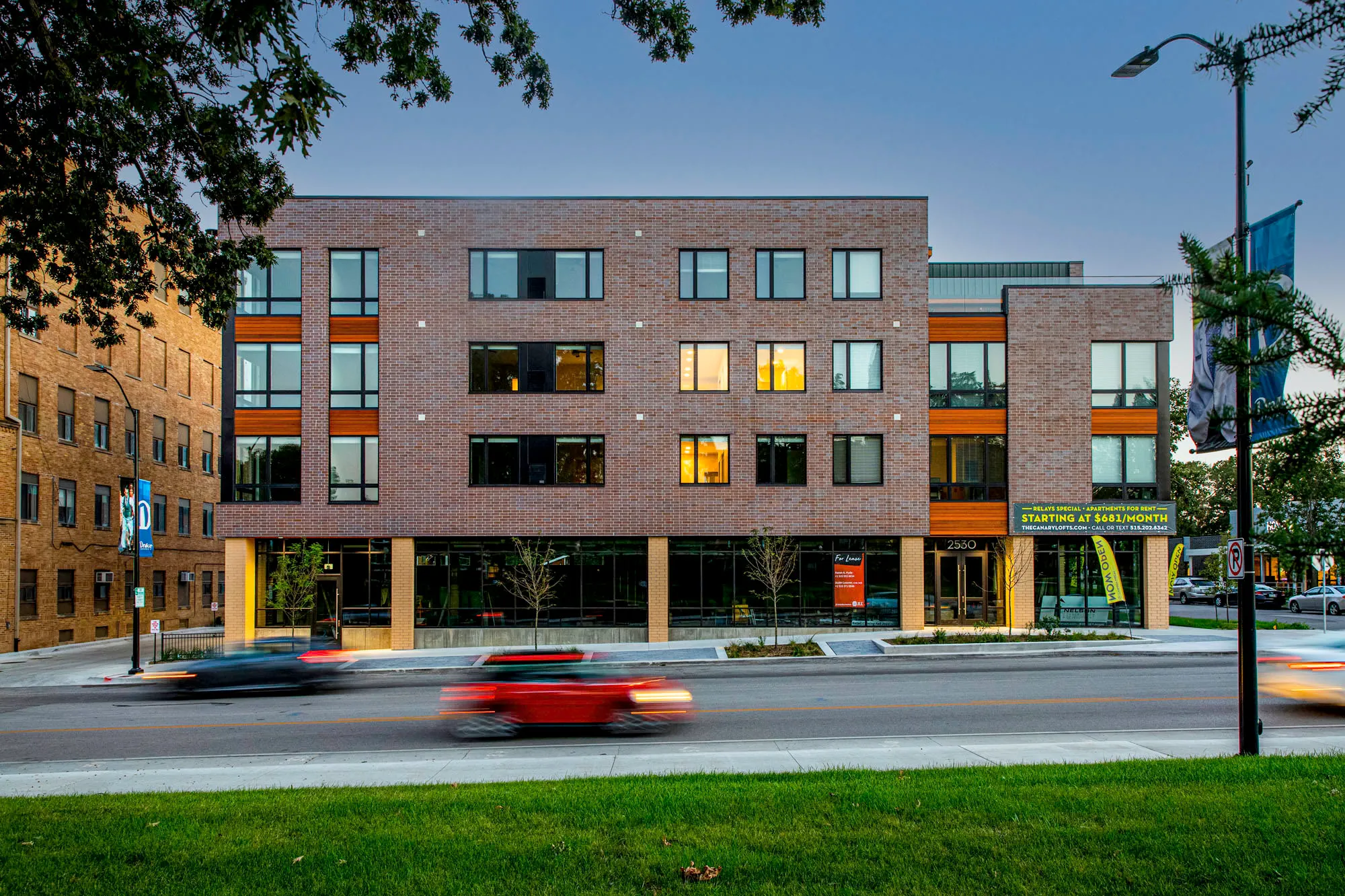
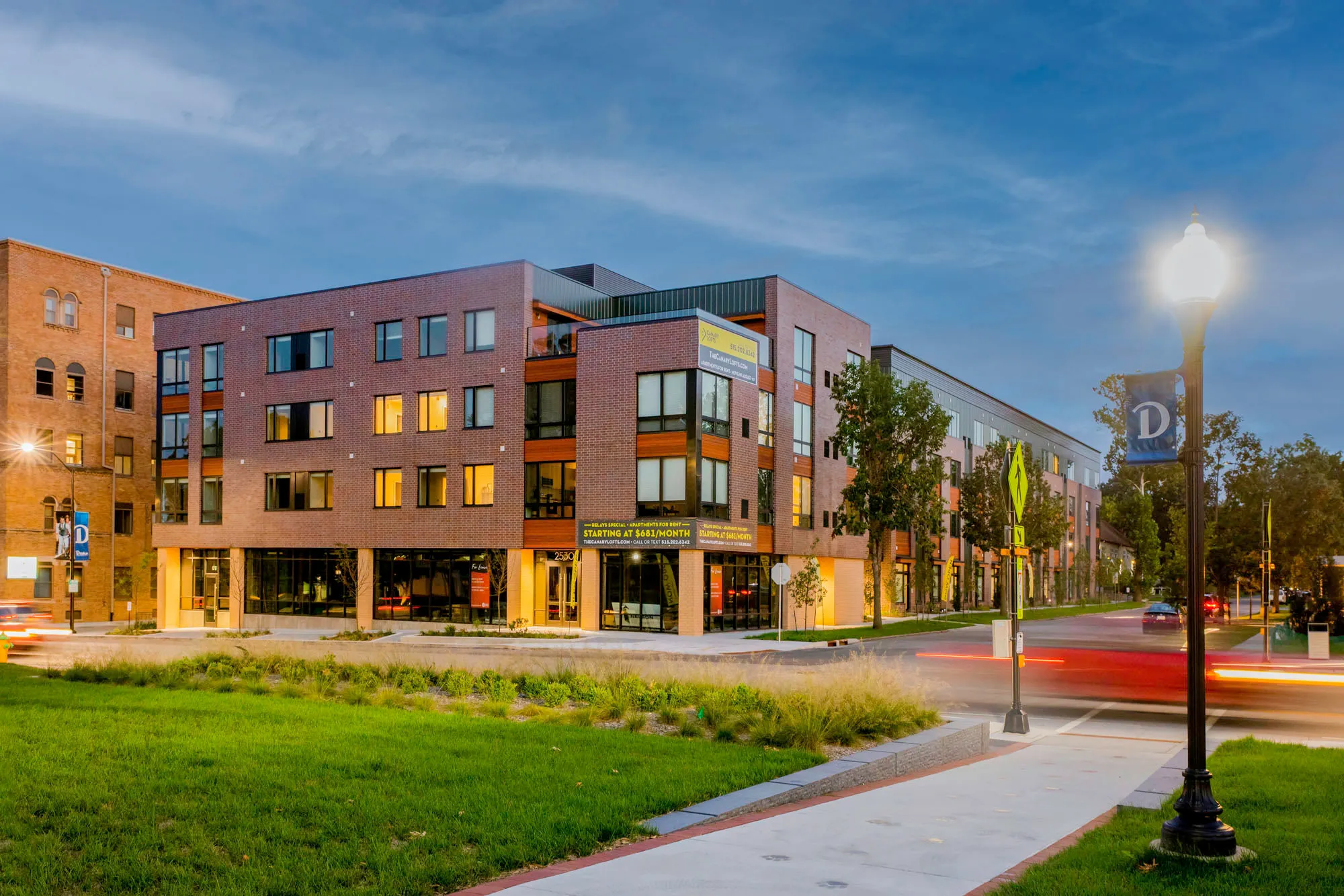
Signage and printed collateral came from the same commission as the identity and the site. The building carries the banner, the feather flags and the address in the same yellow, which is what the dusk photographs show.
What changed
- The building is marketed on the neighbourhood, not the campus. Thirteen named places within a five-minute walk.
- Sixteen plans are presented as three choices. Type first, plans underneath.
- The identity covers the site, the print and the building. All three were made together rather than fitted to each other afterwards.